Buttons
Zur Navigation springen
Zur Suche springen
For a better overview: In any case, it is recommended to name the elements in the inspector so that they can still be distinguished in the evaluation table.
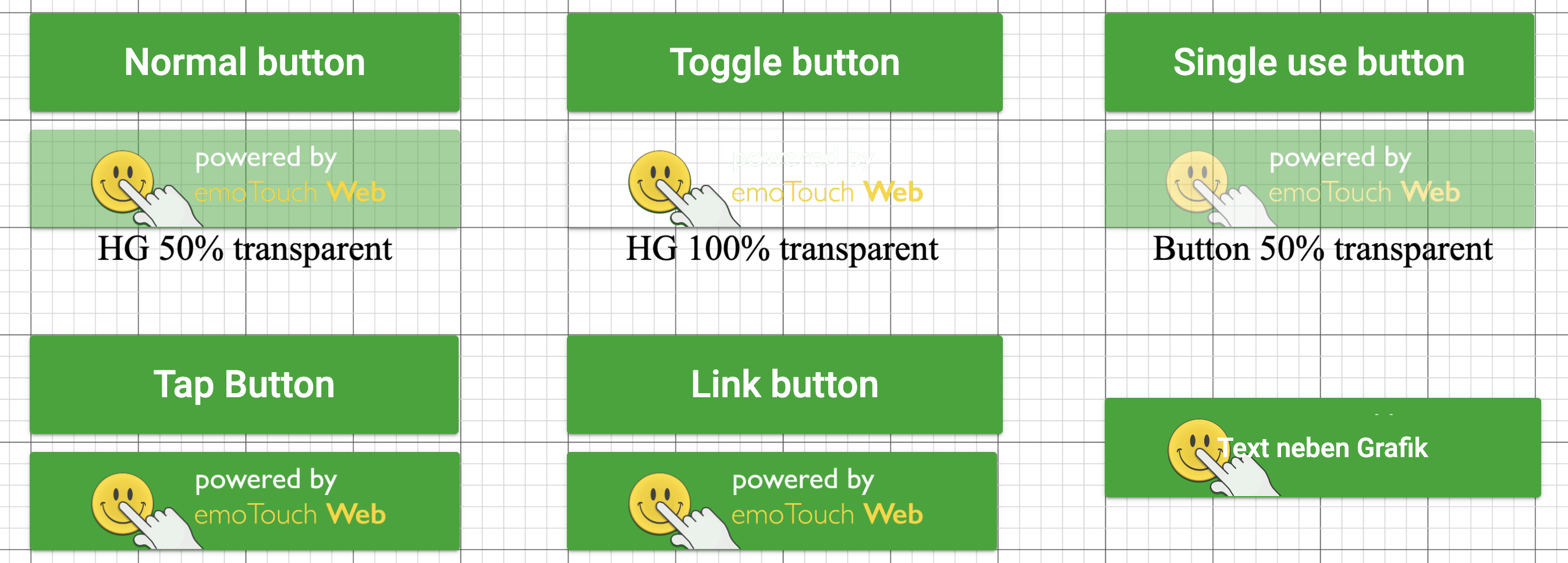
For buttons, there is a choice between:
- Normal
- Toggle (switches between 2 stages)
- Single use (can only change status once)
- Tap (does not change the status, but can be clicked as often as desired)
- External link
- Media pausing (for embedded media)
- Navigation (between parts)
- Navigation with randomisation
- The Part randomisation uses the principle of "drawing with replacement". Therefore, individual Parts can be called more than once or skipped for some participants.
You can add an image to the button in the Inspector under "Select image".
