Buttons/en: Unterschied zwischen den Versionen
Zur Navigation springen
Zur Suche springen
(Übernehme Bearbeitung einer neuen Version der Quellseite) |
(Die Seite wurde neu angelegt: „'''Note on clarity:''' In any case, it is recommended to name the elements in the inspector so that they can still be distinguished in the evaluation table.“) |
||
| Zeile 1: | Zeile 1: | ||
<languages /> | <languages /> | ||
| − | ''' | + | '''Note on clarity:''' In any case, it is recommended to name the elements in the inspector so that they can still be distinguished in the evaluation table. |
<div class="et-screenshot"> | <div class="et-screenshot"> | ||
Version vom 3. Juli 2023, 14:26 Uhr
Note on clarity: In any case, it is recommended to name the elements in the inspector so that they can still be distinguished in the evaluation table.
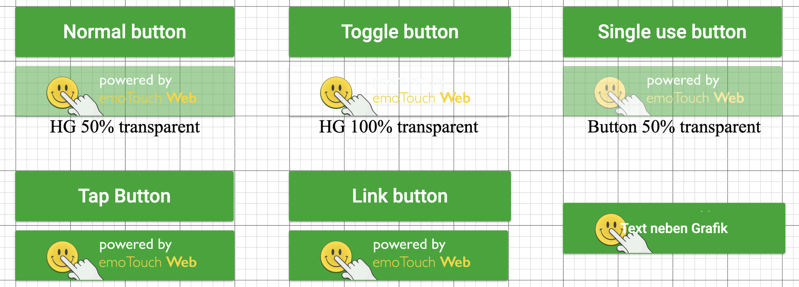
For buttons, there is a choice between:
- Normal
- Toggle (switches between 2 stages)
- Single use (can only change status once)
- Tap (does not change the status, but can be clicked as often as desired)
- External link
- Navigation (between parts)
- Navigation with randomisation
- Media pausing (for embedded media).
You can add an image to the button in the Inspector under "Select image".
